For hoteliers and revenue management teams, being on the watchout for anomalies is crucial. In Pt.1 of this article, we've already covered the workforce that goes into this task as well as the risk that is associated with ... well, both: the anomaly-observation and the anomalies themselves.
At HQ revenue we’ve given this a few thoughts, so now we can proudly introduce an assistant system that relies on the best market data there is – ours. Here's how it works:
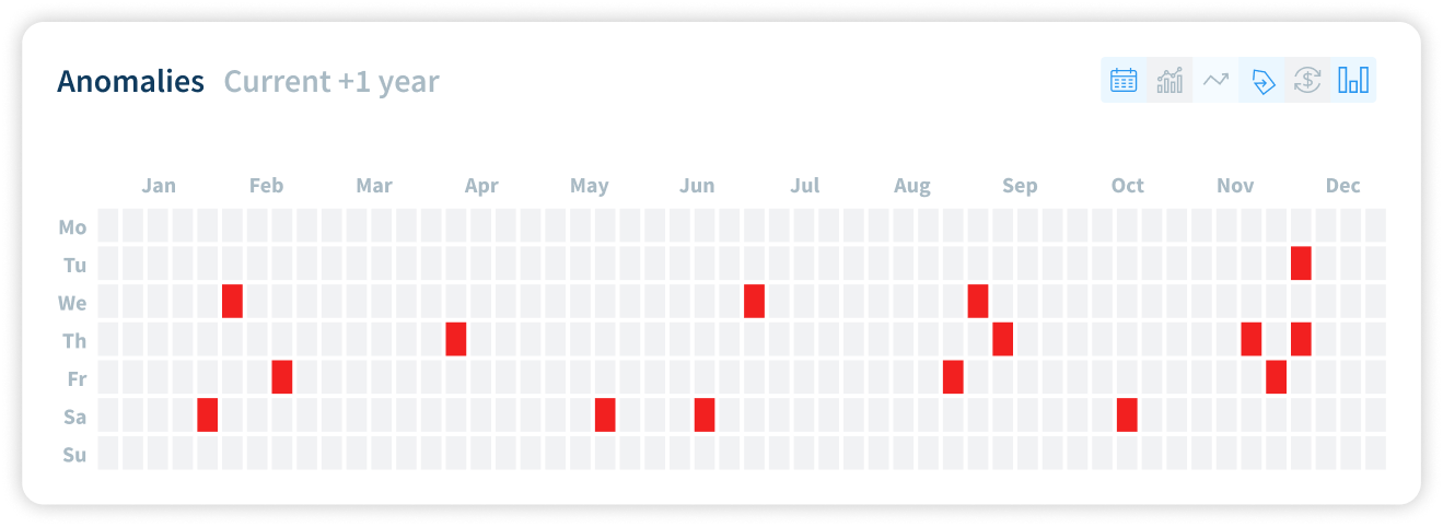
1 – Anomalies at a glance: Anomaly Heatmap Widget
The Heatmap widget shows all anomalies spanning 365 days.
The widget will list all the anomalies over a period of 365 days. Regardless of the number of anomalies occuring a specific day, should there be an anomaly the day will be highligted in red and clicking on it will pop up the new Single Click, listing all the details.
By default the the Anomaly Filter will have all the anomalies highlighted. Should users need to see specific anomalies, they can toggle the anomaly filters on/off one by one. For recognizing what is what anomaly, the Anomaly Filter will have tooltips on hover for each icon:
2 – Analyze upcoming market chaos in greater detail: the Alerting Feed
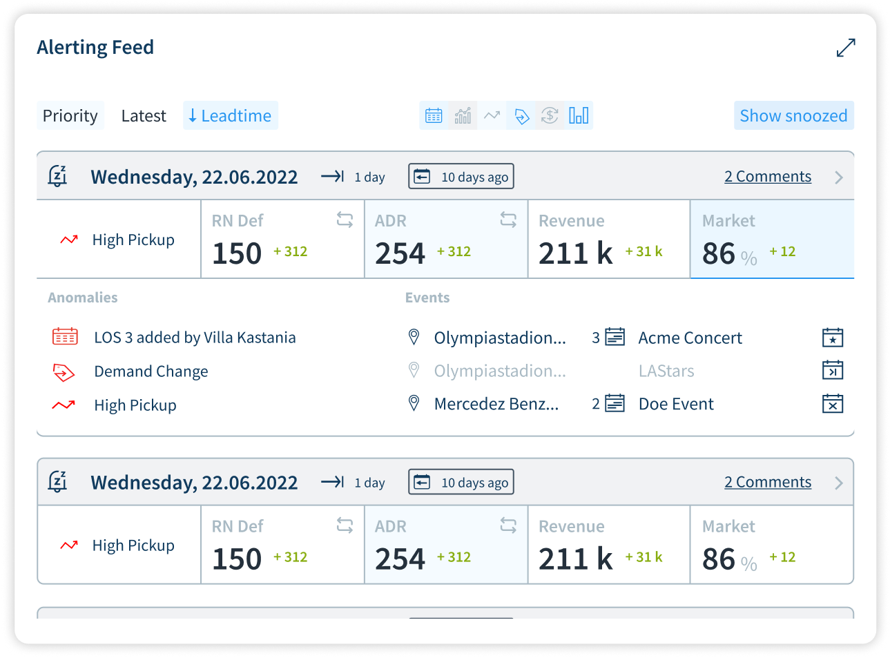
The Alerting Feed lists all the days (as cards) where anomalies have been found along with leadtime, and timeslider badges.
The timeslider setting is displaying the amount of days in the past with which the anomaly has been found. This is independent from the global timeslider setting of the app. The pickup values presented in the day card are referring to the timeslider setting of the anomaly.
Users can sort the cards with options for Priority (Toggle), Latest (Toggle), as for Leadtime (ascending/descending).
Again, users have filter options for types of anomalies, and can toggle the anomaly filters on/off one by one. For recognizing what is what anomaly, the anomaly filter will have tooltip on hover for each icon (as seen in the example). The last selected filter combination of the user will be saved.
Card Contents
The cards show details about the anomalies:
- Highest Priority Anomaly of the day (on hover will show more details in a tooltip)
- RN Def (Swappable with Occupancy by clicking on swap icon
- ADR (Swappable with RevPAR by clicking on swap icon
- Revenue
- Demand (in Market Tab)
In expanded view, the anomalies and events will be shown. If there are more items it will have a scroll on hover. Anomalies with the highest priority will remain on top.
Comments
Every day card header has a comment button on the right. Users can add relevant comments on the specific day to be referred to earlier. Once a comment is added, it will show the number of comments on that specific day. Of course, the comments can be edited or deleted.
Calendar Icons
- Multi-day Event - if an event extends to more than a day
- New Event - if a new event is found
- Event postponed - if the event is postponed
- Event Cancelled - if the event is cancelled
Snooze Feature
The card headers has a Snooze feature where you can snooze unwanted anomalies and stop seeing the same in the future. On hover you will get an option to choose to remind you about the anomaly at a later date from the calendar. After the snooze period is over the day will move back into the regular anomaly feed.
Snoozed days will be crossed out and hidden can be found in the Show Snoozed section.
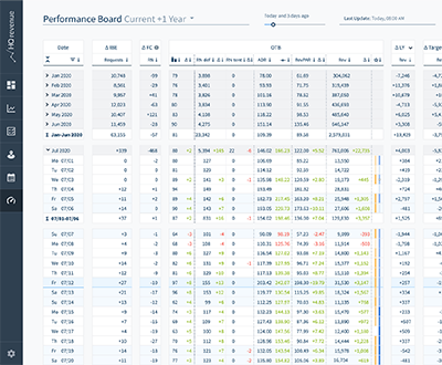
Anomalies: Analyze from all perspectives, and access from all sides
Anomalies will be shown on Smart View, Performance Board, Parity Check & Area Demand - these will be shown next to the Event Log. Depending on their priority level, the anomalies are being displayed in different shades of red.
Share this
HQ revenue Expands Product Range with Performance Board
Integration of Occupancy Data in HQ revenue
.jpg?width=400&height=330&name=hq-revenue_blog_zeitfresser-im-revenuemanagement-tools_kl%20(1).jpg)